
Wedding Color Palette 2026 and 2027: Six Schemes to Love
Color is the first decision that touches everything else. Before the flowers are chosen or the invitations are printed, a couple settles on a mood, and that mood is almost always a color. It shows up on the save the date, in the bridesmaids’ dresses, on the napkins folded at each place, in the light […]

Color is the first decision that touches everything else. Before the flowers are chosen or the invitations are printed, a couple settles on a mood, and that mood is almost always a color. It shows up on the save the date, in the bridesmaids’ dresses, on the napkins folded at each place, in the light that pools on the tables at dusk.
Get the palette right and the whole day feels of a piece. This guide walks through six wedding color palettes for the 2026 and 2027 season, what each one feels like, the season and setting it flatters, and how to carry it from paper to plate to what everyone wears.
At a glance. A wedding color palette is usually two or three lead shades plus a metallic or neutral to hold them together. For 2026 and 2027 the mood is warm and grounded: soft neutrals, sage and terracotta, dusty blue, burgundy and gold, blush and copper, deep emerald. Choose yours around your venue, your season, the quality of the light, and the two of you. The rest, from florals to table settings, follows from there.
Table of Contents
How a wedding color palette holds the day together
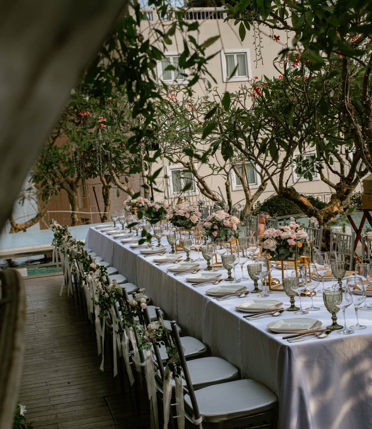
A palette is not decoration for its own sake. It is the thread that runs through a day made of dozens of small pieces, most of them ordered from different people at different times. The stationer, the florist, the tailor, the cake maker and the venue team rarely sit in the same room, yet their work has to look like it belongs together. A clear palette is what makes that happen. When everyone is working from the same two or three shades, a room that was assembled in parts reads as one considered whole.
The strongest palettes are simple. One or two lead colors carry the mood, a softer shade supports them, and a metallic or a neutral, gold, cream, ivory, ties everything off. Trends move slowly here, and the season ahead leans warm and natural rather than bright and graphic. Below are six schemes worth living with, each with the feeling it creates and the practical ways to wear it through the day.
1. Soft neutrals and cream
This is the quietest palette on the list and, for many couples, the most enduring. Think oat, sand, greige, oyster and warm white, layered so the difference between them is felt more than seen. Nothing shouts. The effect is calm, timeless and quietly luxurious, the kind of room that photographs as beautifully in ten years as it does on the day.
It suits a light-filled celebration best, a morning ceremony or an early afternoon reception where daylight can do the work, and it flatters almost any setting, from a pared-back modern space to a heritage room with character of its own. On paper, choose thick cream stock with soft taupe ink and perhaps a single pressed detail.
Florals stay textural rather than colorful: cream roses, ranunculus, dried grasses, a little foliage for depth. Dress the tables in linen with unpolished ceramics and clear glass. For attire, undyed and champagne tones keep the party in the same gentle key. If you worry it reads too plain, let texture be your color, raw silk, rattan, candle wax, wood.
2. Sage green and terracotta
Sage and terracotta are the palette of a long lunch that runs into evening. Muted green meets warm clay, an earthy pairing that feels relaxed and grounded without tipping into rustic. It is one of the most versatile schemes of the season because it borrows from nature, and nature rarely clashes.
This one loves an outdoor or half-outdoor setting and the warmer months, a garden ceremony, a terrace dinner, a rooftop as the heat softens. Terracotta gives it enough warmth for the golden hour; sage keeps it fresh. For stationery, pair a sage envelope with terracotta ink or a clay-toned seal. Florals are where it sings: olive and eucalyptus foliage, dusty pink and rust blooms, the odd dried element. On the table, mix terracotta candles and amber glass with green-tinged linen. Bridesmaids in sage, groomsmen with a terracotta pocket square or tie, and the two colors carry effortlessly across the party.
3. Dusty blue and champagne
Dusty blue is a soft, greyed-down blue that reads as calm rather than cool, and champagne warms it just enough to keep it from feeling formal or wintry. Together they are elegant and a little romantic, a palette for a couple who want something classic without the expected navy-and-white.
It works beautifully across seasons and leans towards an indoor celebration, a ballroom, an evening reception, anywhere candlelight and a little sparkle belong. Champagne is a gift here because it doubles as your metallic, so glassware, chargers and stationery accents all pull in the same direction. Print invitations in soft blue on cream, or reverse it. Choose florals in white, pale blue and cream with silver-green foliage, delphinium, hydrangea, dusty miller. Set the table with champagne linen, gold or antique-silver flatware and blue glass water goblets. Dress the party in dusty blue for a scheme that flatters a wide range of complexions and photographs cleanly under warm light.
4. Burgundy and gold for a warm evening
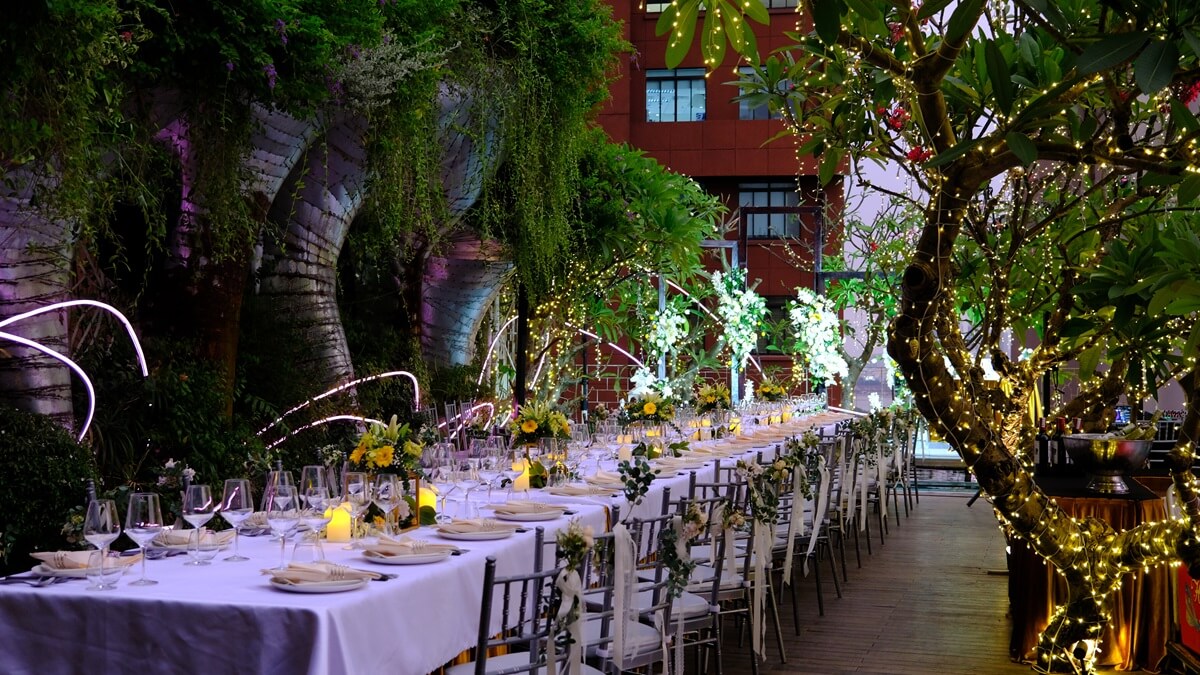
When the celebration belongs to the evening, few palettes carry candlelight like burgundy and gold. Deep wine red with warm metallic gold is rich, grown-up and unmistakably festive, a scheme built for a room after dark. It has real drama, so it rewards restraint: let burgundy lead and gold accent, not the other way around.
This is a cooler-months and evening palette, well suited to a late-year wedding or a reception that flows into the night, and it belongs indoors or on a covered rooftop where lighting can be controlled. It also sits naturally alongside a year-end celebration mood, the same warmth you would want at a festive gathering. Print on ivory with burgundy and gold foil. Florals go deep and lush: burgundy dahlias and roses, dark berries, gold-brushed foliage. Dress the tables in burgundy runners over ivory, gold-rimmed glassware and plenty of tapers. Groomsmen in charcoal or deep green, bridesmaids in burgundy, and the whole room glows once the candles are lit.
5. Blush and copper
Blush and copper is the warm cousin of the old blush-and-rose-gold pairing, a touch earthier and a touch more modern. Soft pink meets a burnished metallic that has more depth than gold and more warmth than silver. The result is romantic without being sweet, which is exactly why it has aged so well.
It suits an autumn celebration or a warm evening indoors, and it flatters low, warm lighting, copper practically comes alive by candle. Stationery works in blush with copper foil or a copper wax seal. Keep florals soft and abundant: blush and peach roses, dahlias, a little dusty foliage, with copper carried through in the vessels rather than the blooms. On the table, copper candlesticks, amber or smoked glass, and blush linen or napkins. Dress bridesmaids in blush and let copper appear in the details, a belt, a cuff, the stem of every glass. It is a gentle palette that still feels current heading into 2027.
6. Deep emerald and ivory
Emerald and ivory is the boldest scheme here and the most classic at the same time. A jewel-deep green against soft ivory is striking, confident and a little regal, a palette with heritage in its bones. Emerald carries weight, so ivory is essential to let it breathe.
It works year round and suits a formal, indoor celebration, a ballroom, an evening reception, a room with architecture worth answering. There is something naturally at home about deep green in a space with heritage detail, dark wood, ironwork, tall windows. Print on ivory with emerald and a whisper of gold. Florals lean lush and green with white blooms: white roses, greenery, a few gold touches. Dress the tables in emerald over ivory with gold flatware and crystal. Groomsmen in emerald velvet or dark suiting, bridesmaids in emerald, and the palette does all the work, no other color required.
How to choose your palette
Six schemes, and every one of them can be beautiful. The question is which is right for your day, and four things decide it.
- Your venue. Look at the room before you fall for a palette. A space with strong character, heritage detail, colored walls, a view, already has a color story, and the best palettes answer it rather than fight it. Bring a swatch and hold it up in the actual light.
- Your season. Warm months carry sage, terracotta, dusty blue and blush; cooler months and the year-end stretch suit burgundy, gold and emerald. The season also sets what your florist can source at their best.
- Your light. A daytime celebration in natural light flatters soft neutrals and pastels; an evening lit by candle and warm bulbs brings the deeper, metallic palettes to life. Decide when your day peaks, then choose for that hour.
- The two of you. A palette should feel like you, not like a trend you will tire of. If neither of you would wear a color, be cautious about wrapping a whole day in it. The schemes that endure are the ones a couple actually loves.
For where these palettes sit within the wider picture of the season, our guide to wedding trends for 2026 and 2027 is a good companion read. And if your celebration falls at the close of the year, the same warm, candlelit mood runs through our guide to year-end events.
A word on setting
A palette needs a room to live in, and the room shapes the palette as much as the other way round. At The Myst Dong Khoi, a boutique heritage hotel in the heart of District 1, the settings do some of the work for you: a rooftop that catches the golden hour, the twelfth-floor calm of The Nest, and a ballroom that holds candlelight well.
Deep emerald finds its match in heritage detail; burgundy and gold warm to an evening on the rooftop; soft neutrals glow in daylight. Whichever scheme you land on, the events team can help you carry it through the day, and shape a boutique wedding around it.
Frequently asked questions
What is the most popular wedding color palette for 2026?
There is no single winner, but the clear direction for 2026 is warm and natural rather than bright. Soft neutrals and cream, sage and terracotta, and dusty blue with champagne are among the most requested, alongside richer evening schemes like burgundy and gold. The common thread is grounded, timeless color rather than bold graphic contrast.
How many colors should a wedding palette have?
Two or three is the sweet spot. Most strong palettes use one or two lead colors to set the mood, a softer supporting shade, and a metallic or neutral such as gold, cream or ivory to tie everything together. More than three or four and a room starts to feel busy rather than considered.
How do I choose a wedding color palette?
Start with your venue, your season, your light and your own taste. Look at the room in the light you will actually use it, warm months and daylight suit softer palettes while cooler months and evening celebrations carry deeper, metallic ones. Above all, choose colors the two of you genuinely like, since those are the ones that still feel right years later.
What wedding colors work best for an evening reception?
Evening celebrations flatter deeper, warmer palettes because they come alive under candlelight and warm lighting. Burgundy and gold, deep emerald and ivory, and blush and copper all glow after dark. Lighter palettes can look flat once daylight goes, so if your day peaks in the evening, lean into richer shades and a metallic accent.
Are dusty blue and sage green still in for 2026 and 2027?
Yes. Both have moved from trend to near-classic, and they remain among the most versatile choices for the season. Dusty blue paired with champagne reads elegant and works across seasons, while sage green with terracotta suits garden, terrace and warm-weather celebrations. Their staying power is exactly why so many couples still choose them.
Can The Myst Dong Khoi help me plan a wedding around a palette?
Yes. The Myst Dong Khoi is a boutique heritage wedding venue in District 1 with a rooftop, the twelfth-floor Nest and a ballroom, and the events team tailors each wedding to the couple. You are welcome to share the palette and mood you have in mind, and the team will help you carry it through the setting and the day.
Talk to us about your wedding
The Myst Dong Khoi is a boutique heritage hotel in the heart of District 1, with a rooftop, the twelfth-floor Nest and a ballroom for celebrations. Whatever palette you have fallen for, our events team is glad to help you shape a wedding around it, from the setting to the smallest detail.
→ Talk to our events team about a boutique wedding
→ [email protected] · +84 28 3520 3040
→ Read our guide to wedding trends for 2026 and 2027
Crafted by Silverland Hotels.
Others
Marseille Roof Tiles: From the Clay Pits of Marseille to the Roofs of Saigon
In 2004, when a few damaged tiles were taken down from the roof of Notre-Dame Cathedral in Saigon, the words...
The Ba Son Shipyard: Two Centuries on the Saigon River
Ride Saigon’s Metro Line 1 out of Opera House station and the next stop is called Ba Son. Most passengers...
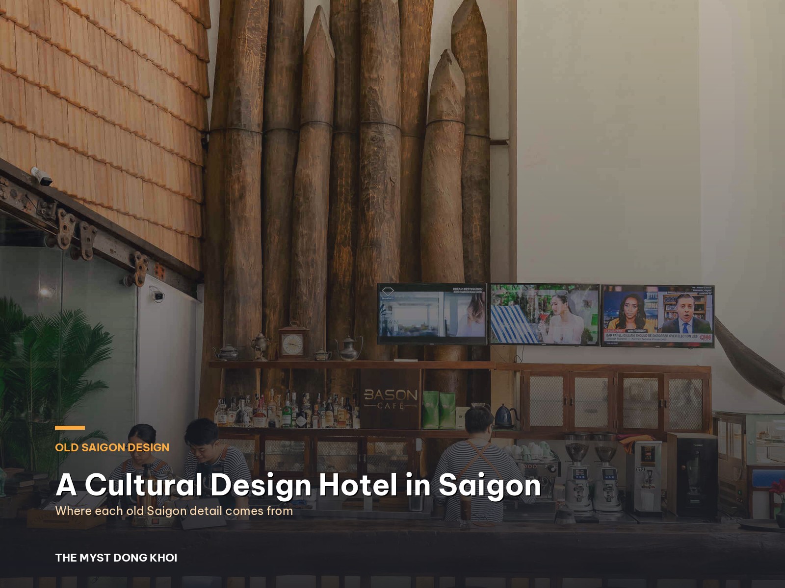
Old Saigon, detail by detail: inside a cultural design hotel Saigon can call its own
Turn off Đồng Khởi into Hồ Huấn Nghiệp street and within a minute you reach a tall building with greenery...
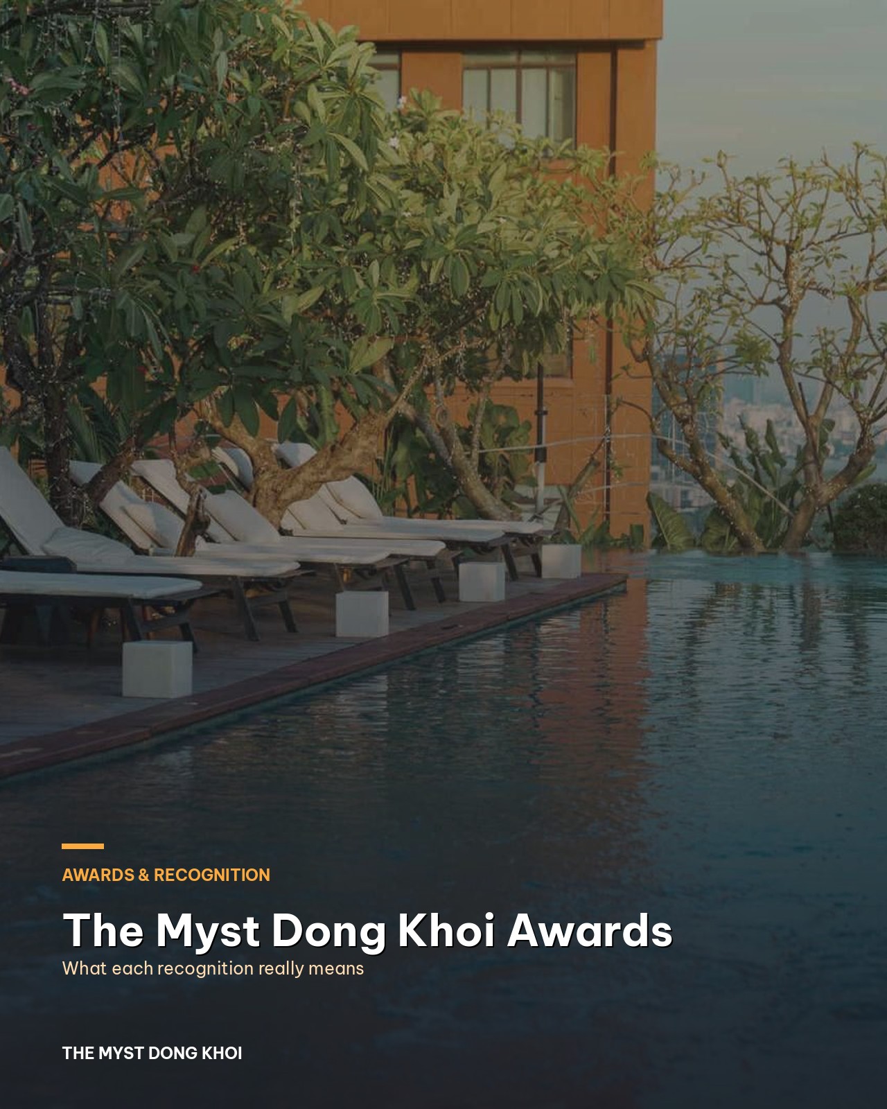
The Myst Dong Khoi awards: what each recognition tells you before you book
Stand on Hồ Huấn Nghiệp street in the early evening and look up. The windows and balconies of The Myst...
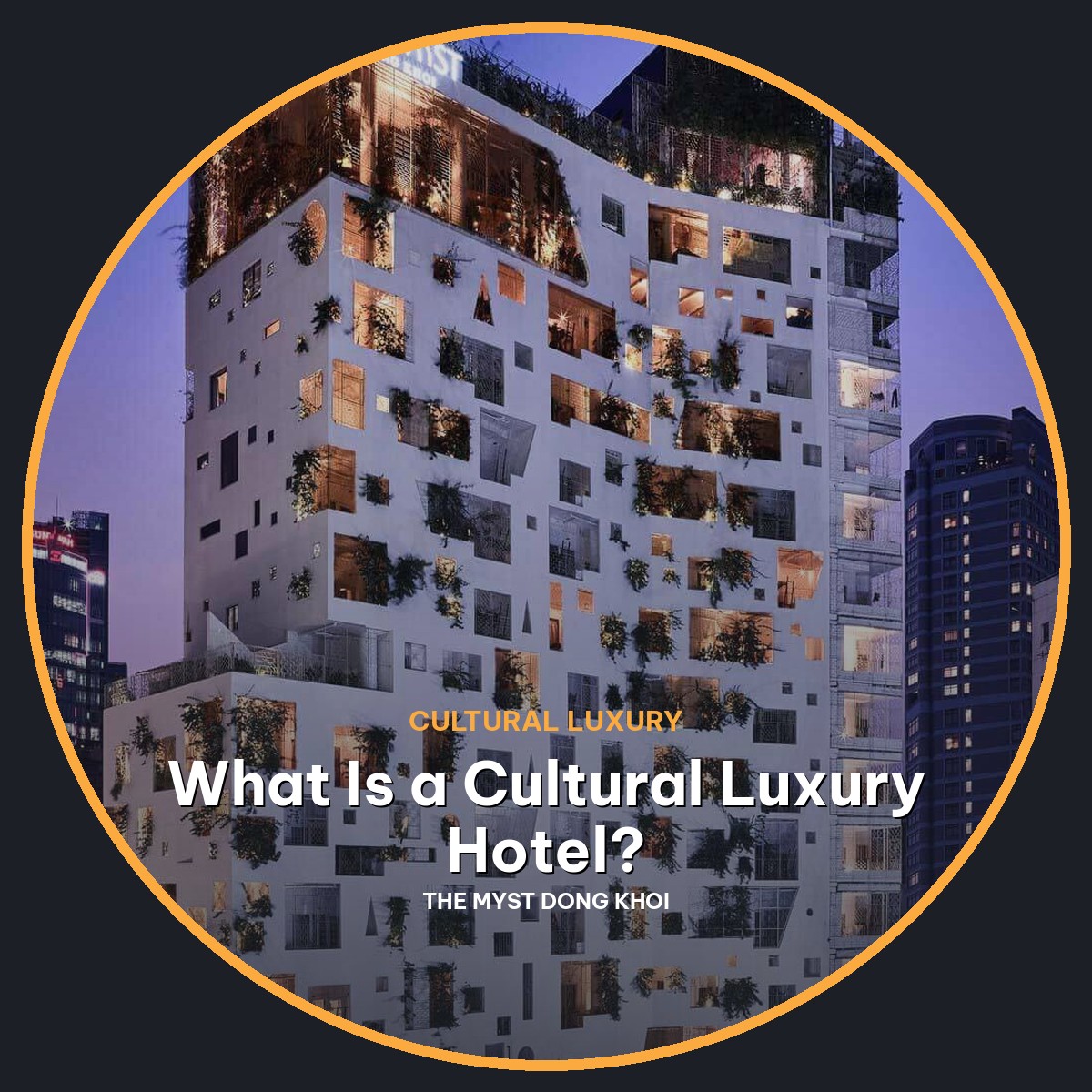
What Is a Cultural Luxury Hotel? How to Spot One Before You Book
It is eleven at night and you have seven booking tabs open for a trip to Saigon. Every hotel calls...
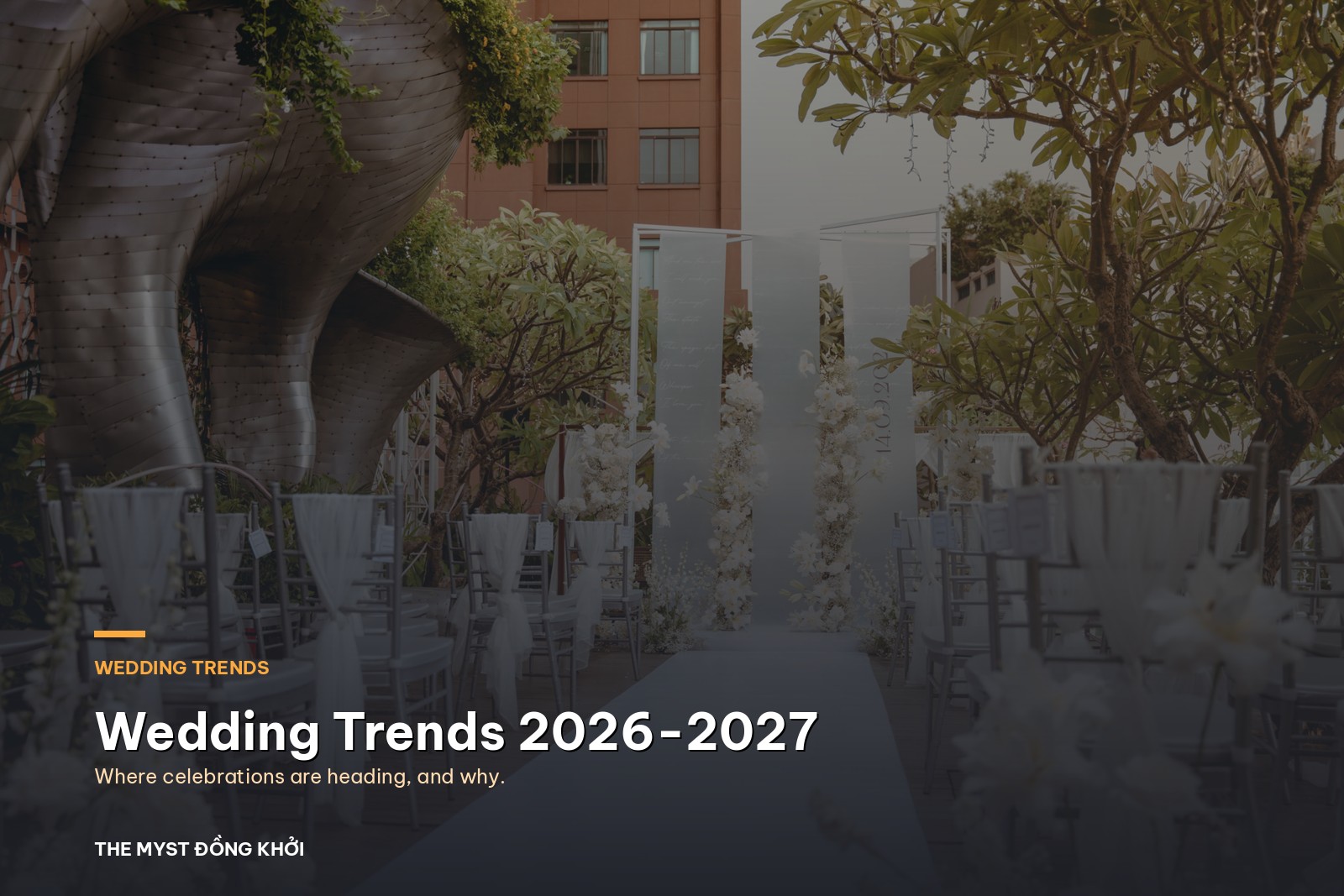
Wedding Trends 2026-2027: Where Celebrations Are Heading
Weddings are quietly changing shape. The five hundred guest banquet is no longer the default, the flower budget is being...